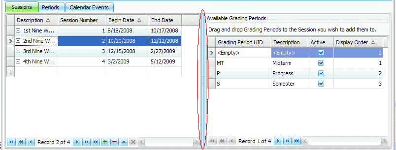
Several tools within the system make using the Student Information System easy. The Ribbon Pages allow you to navigate to the different areas within the system quickly. There are several features within the Data Grids that allow you to manipulate the way you view the data to your specifications. Any grid within the system can be manipulated using these features.
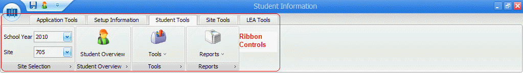
Ribbon Controls
The Ribbon Controls are the Ribbon Pages, Ribbon Groups, Menus and Buttons that display at the top of the screen and allow you to move to a different area within the system or manage the current Ribbon Page.
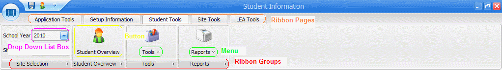
The way the Ribbon Controls display is dependent upon which Ribbon Page you are currently working with. The Ribbon Groups distinguish the main group(s) within each Ribbon Page. The Menus drop down and allow you to choose which task you would like to work with in that Ribbon Group. You can also move to a different Ribbon Group by clicking a Button. The Drop Down List Box that displays allows you to select the School Year and Site you would like to work with.
You can customize the Quick Access Toolbar to display the commands that you use most frequently. To customize the Quick Access Toolbar, right-click a command icon on the Ribbon and choose Add to Quick Access Toolbar. To remove a screen or menu, right-click the icon and select Remove from Quick Access Toolbar.
Ribbon Pages
The Ribbon Pages allow you to move to the different areas within the system quickly. The Ribbon Page displays the data grid(s) you are currently working with. The system displays the name of the current Ribbon Page you are working with at the bottom left hand corner of the screen. If an area of the page is grayed out, then it is inactive.
Grid Buttons
To add a record, click the  Button.
To edit a record, click the  Button.
To delete a record, click the  Button.
In some of the fields you will notice the  Button.
This button indicates that there is more data to be viewed or that needs
to be entered for the record. To open the details, click the Button
and to close the details, click the
Button.
This button indicates that there is more data to be viewed or that needs
to be entered for the record. To open the details, click the Button
and to close the details, click the  Button.
If a button is grayed out, then it is inactive.
The Navigation Bar consists of six buttons:
The first button is a shortcut that takes you to the First Record. When you click this button it will take you directly to the first record in the particular grid in which you are working.
The second button is a shortcut that takes you up one page and is called Page Up. When you click this button it will take you directly to the page prior to the current page.
The third button is a shortcut that takes you to the Prior Record. When you click this button it will take you directly to the prior record in the particular grid in which you are working.
The fourth button is a shortcut that takes you to the Next Record. When you click this button it will take you directly to the next record in the particular grid in which you are working.
The fifth button is a shortcut that takes you down a page and is called Page Down. When you click this button it will take you directly to the next page after the current page.
The sixth button is a shortcut that takes you to the Last Record. When you click this button it will take you directly to the last record in the particular grid in which you are working.
If a button is grayed out, then it is inactive.
Column Headers
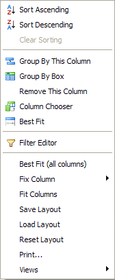
The Column Headers are located at the top of each column within the grid. If you right-click in the column header, a drop down list will display with tasks you can select to personalize the grid.
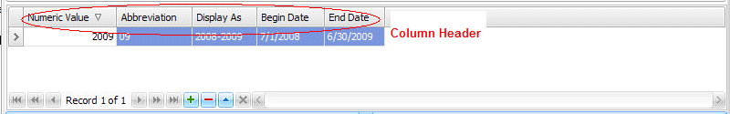
You can sort the data within a single column from ascending to descending order or vice versa by single clicking the Column Header. A triangle will display in the Column Header to indicate if the data is sorted from high to low value or low to high value. If you would like to sort the data in multiple columns, click a Column Header and then push the Shift Key on your keyboard and click the other Column Headers with your mouse.
Whenever you see the  Icon
displayed in a field, this indicates a required field where data must
be entered.
Icon
displayed in a field, this indicates a required field where data must
be entered.
To view information on reformatting the grid, click here.
Refresh
The Refresh Button is used to refresh or update records displayed in a grid. If you click this button, the system will display the latest change made by other users.
The Refresh Button can also be used to open the grid in a window, which allows you to maximize and minimize the window as well as have multiple windows open at one time.
To utilize the Refresh Button, move your mouse to the upper left-hand
corner of the grid you would like to refresh. Click the  Button. The Refresh Control will appear:
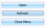
Click the  Button to open
the grid in a window. Click the
Button to open
the grid in a window. Click the  Button to refresh the data.
Filter
The Filter Button is located in the Column Headers and can be applied to any column within the grid.
To apply a filter, move the mouse to the specific Column Header and click the Filter Button. You can filter a single column or select Custom and filter multiple columns. The bottom left-hand part of the grid shows if you have a filter applied to that grid.
To clear the filter, click the  Button in the lower left-hand part of the grid.
Search
To search for a specific record within a grid, highlight anywhere in that column and begin typing the specific name. For example, if you would like to search for a specific student's record within a grid, click anywhere in the Name Column and begin typing the student's name. Whenever their name appears, click enter to access that record.
Resizing the Grid
To resize the grid, you can adjust the frame by positioning your mouse pointer over the border of the column or row until the resizing handles appear and then click, drag and drop the frame to the desired position.
If you enter data into a field and you are unable to view all of the information entered in that field, you can best fit the data in that column. To best fit in a single column, right-click the Column Header and select Best Fit. To best fit for multiple columns, right-click any Column Header in the grid and select Best Fit (all columns).
Note: Anytime you make a change to the grid, the system saves that change. However, if you would like to reset the grid, there are two options for resetting the grid layout.
1. You can right-click in any Column Header and then select Reset Layout.
2. You can reset all grid layouts to their original state by deleting the xml files from the local directory where the settings are saved on your computer. You can find the location of the settings by doing a search for *gv*.xml on your computer.
You can print a report from any screen within the application by right-clicking in a Column Header and selecting Print from the List Box.
Whenever you login to the Student Information Program, the Main Form will appear:
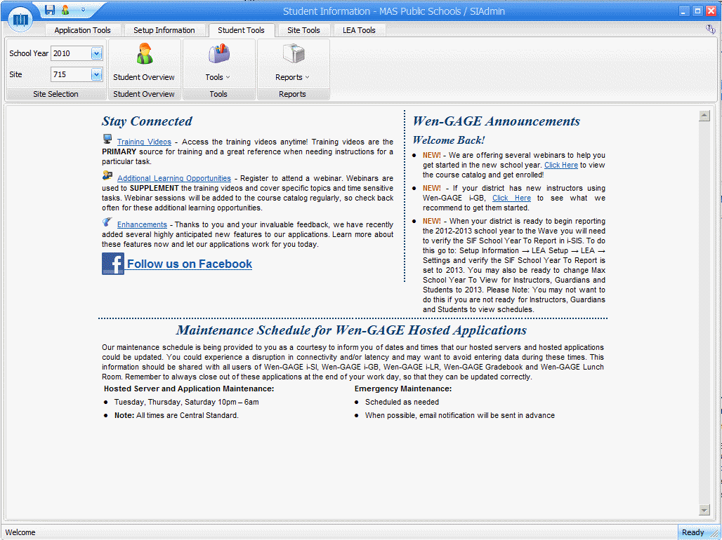
School Year: Use the Drop Down List Box to select the current fiscal year.
Site: Use the Drop Down List Box to select the Site.
To learn more about each Ribbon Page on the Main Form, click the link below:
Setup Information